
The BIBFRAME editor.
Linking bibliographic resources

Libraries needed to start cataloging using linked open data, and the Library of Congress (largest in the world) wants to make their resources available to the world.
Context
There was a demo site to show the functionality designed by librarians and developers with no designers involved.
Problem
A new web-app easy to use for new librarians without needing a course, and with a hierarchy that works efficiently.
Results
My role: Lead UX Designer
Duration: 6 months
Shadowing the catalogers in Washington DC
I had to travel to Washington DC for a week to work together with the catalogers of the Library of Congress. I spent 3 days talking to 8 different catalogers and I shadowed them to see how they work. I gather some of the following info:
Cataloger 1
Good feedback about the existing platform
✅ “I think that the current search engine works pretty well”
❌ “The labels are confusing. I don’t know what to fill in”
Complaints
✅ “The prepopulated things make me save time in my workflow”
Cataloger 2
❌ “People gets lost. They don’t know where they are in the process”
✅ “The lookups are so helpful to disambiguate the authors”
Cataloger 3
❌ “I can’t copy paste some pieces of information”
✅ “Having the preview allows me to check the record fast”
Cataloger 4
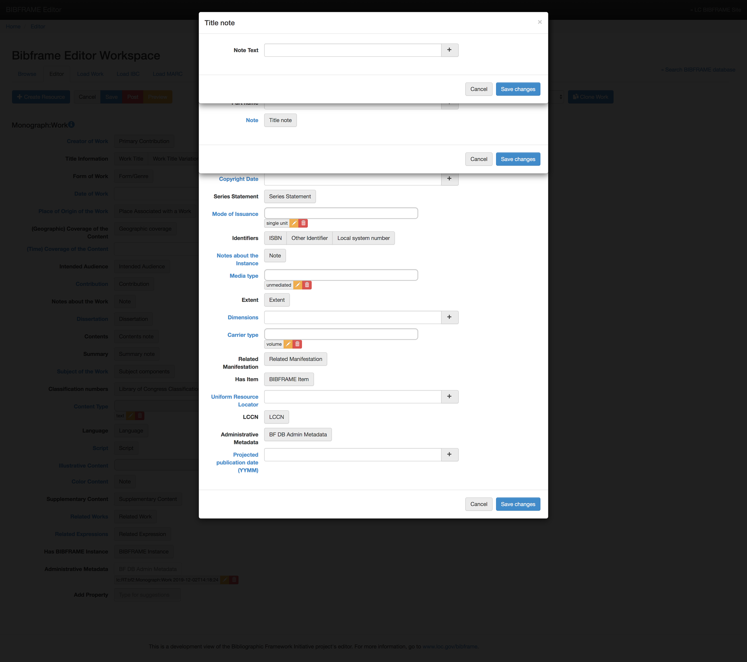
❌ “There are many overlays on top of each other”
Researching and defining pain points
After talking to the catalogers we spent time looking at the current interface, studying the data model, reading all existing documentation and understanding the information architecture of the project.

Let’s turn problems into opportunities
Once we have dived deep in the subject, it was time to ideate taking into consideration the feedback we got from the main users.
Users comments
Design ideas
“The labels are confusing. I don’t know what to fill in”
Plane language + placeholders as examples
“People gets lost, they don’t know where they are in the process”
Create color coding for each entity to distinguish the steps
“To add a single piece of data I have to open several overlays”
Avoid overlays and popovers and display the content in panes
“I am scared of losing my job work when I open the preview page”
Third pane with a user preview + partial savings of the work
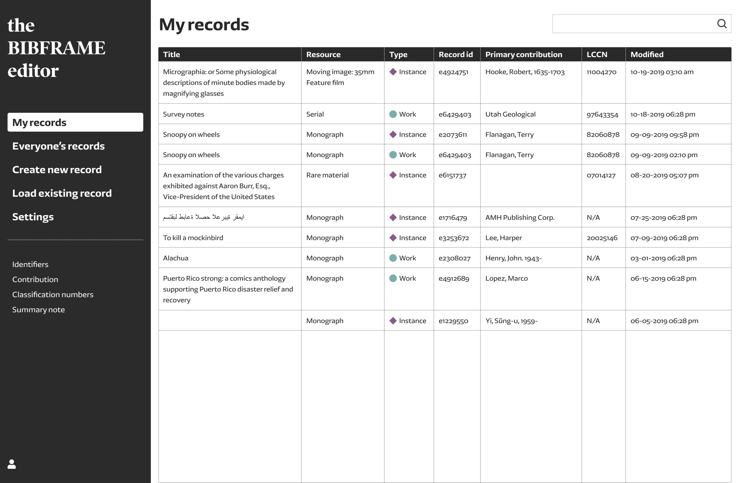
“I often have to come back to a record I cataloged weeks ago”
Have a user account to store all the work each user has done
“I work 8 hours a day with this, I want to customize it”
Settings to custom text size, themes, background colors…
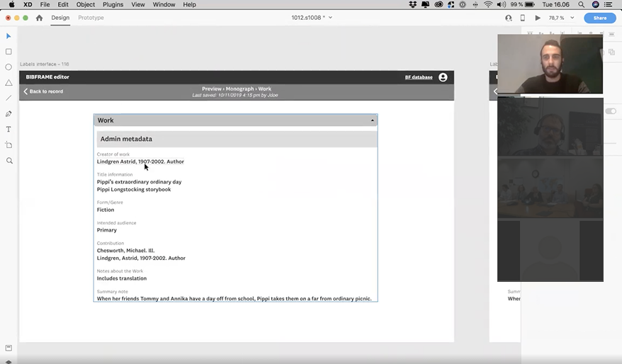
The evolution of the mockups
From first drafts to the final design


All this evolution of the mockups from first drafts to final design wouldn’t be possible without the meetings we had with the Subject Matter Experts 2 times a week. Their feedback, expertise and help, together with our knowledge in design and interactions, allowed to end up with a result that everyone was happy with.
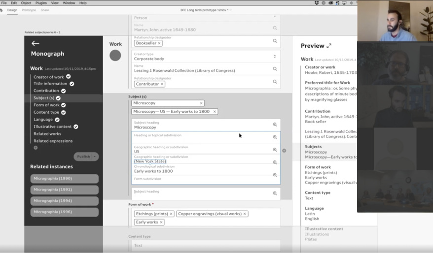
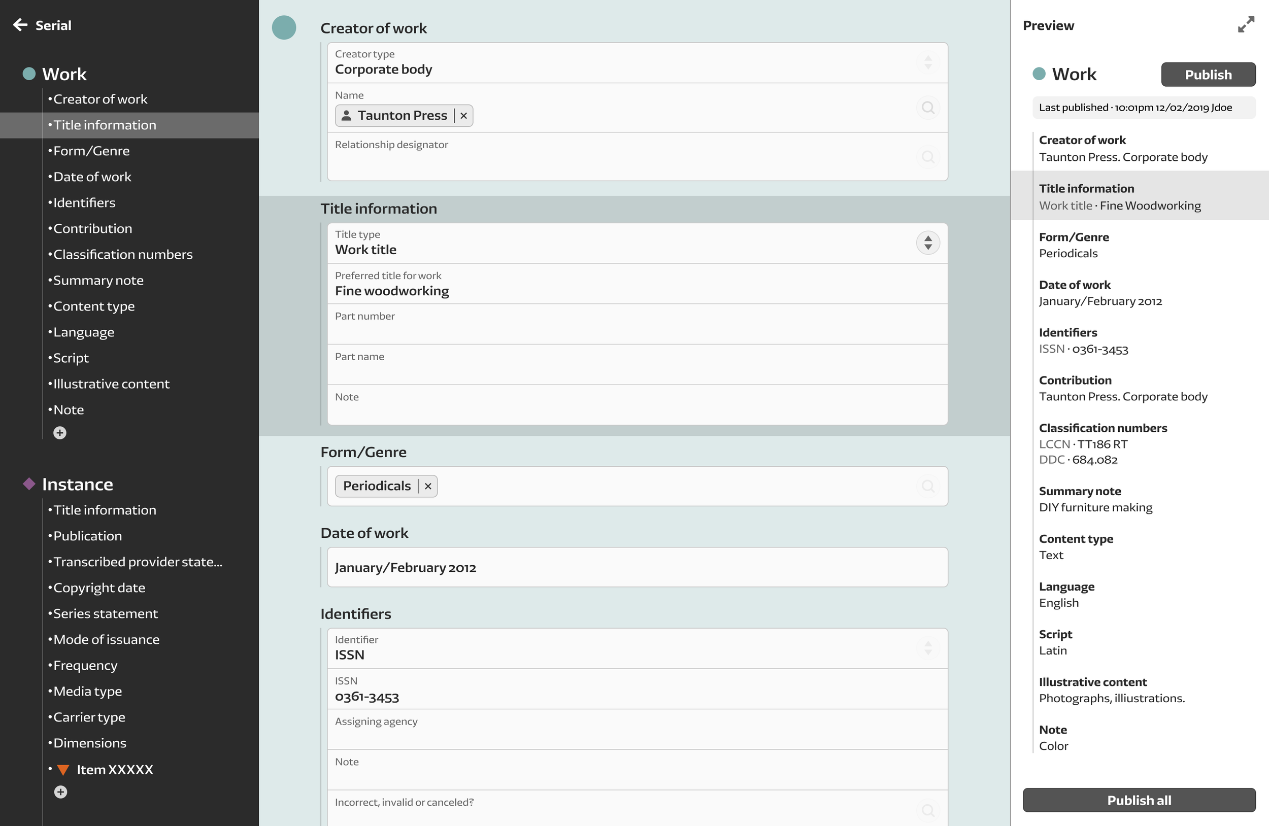
How should the User Interface look like?

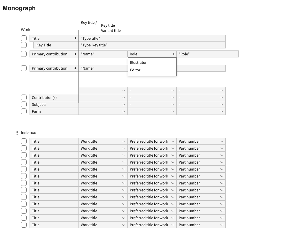
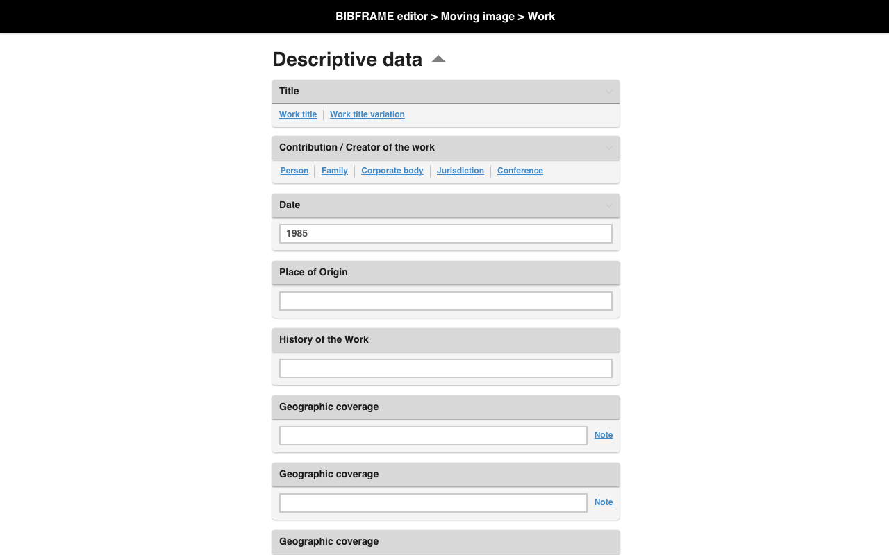
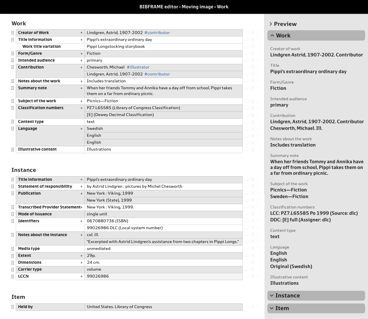
The content is divided in 3 panes to make the hierarchy clear and have always a preview of the record

Each entity in the hierarchy is represented with a different color that will be shown in the background

Clear differentiation between free text and controlled vocabulary to avoid confusion
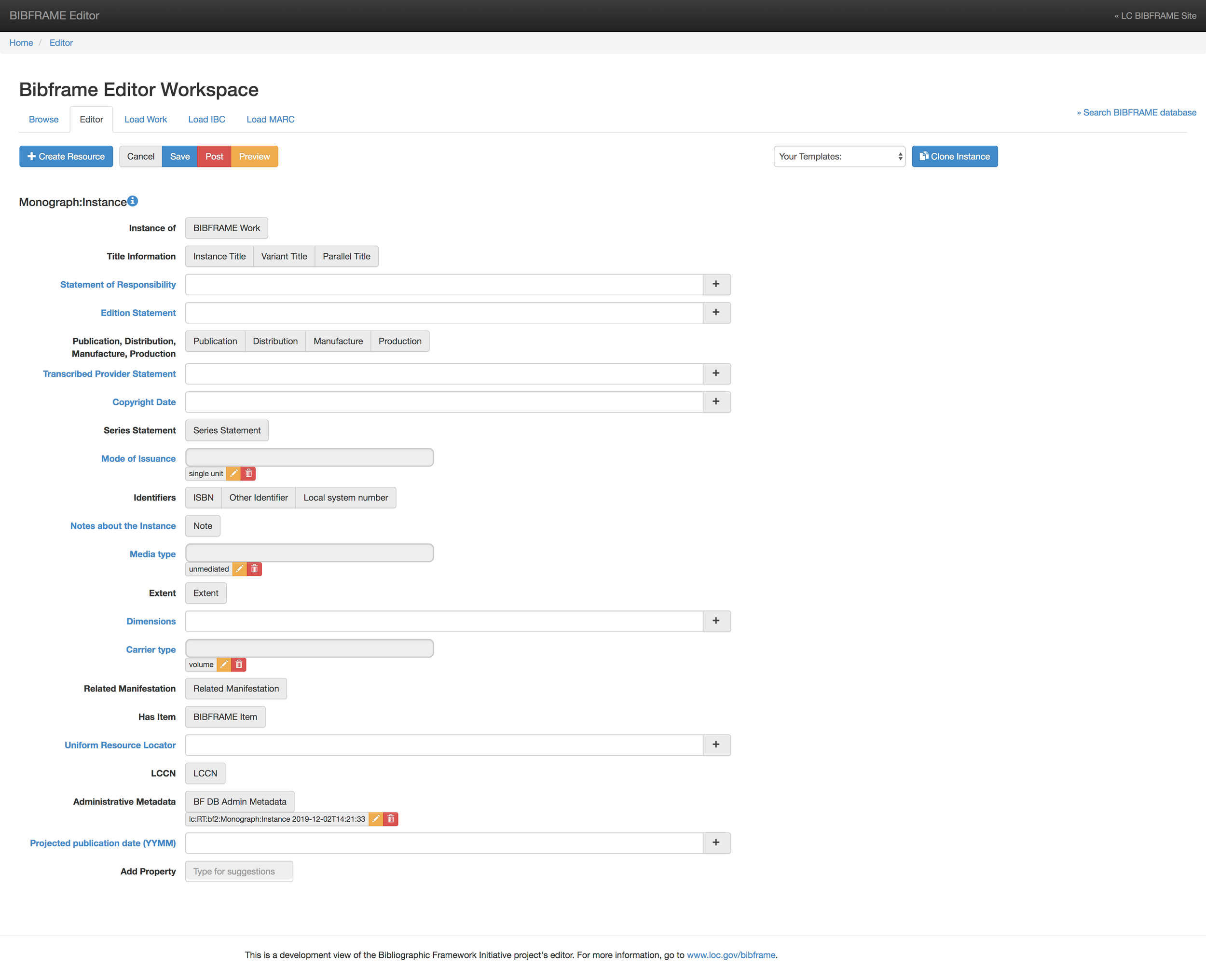
Comparison. Previous design:
Comparison. New design:

How can we measure the success of this project?
The average time to catalog a resource went from 9 to 4 minutes
New librarians didn’t need to take a course from experts to understand the system
Due to the clarity of the interface, no records were lost half-way anymore