
Share-VDE
Breaking the gap between librarians and students

Share-VDE is a library platform that puts together the catalogs of a big community of libraries in North America and Europe. This platform uses a data model called BIBFRAME based on linked data that brings a new way of cataloging resources at the libraries.
Context
There was a demo site to show the functionality for the platform but it wasn’t built thinking of the end-users who are mostly the students of the participant institutions.
Problem
Conducted user research, competitive analysis, user interviews, concept testing, user testing, prototyping, design system.
Design process
After the design was finalized more institutions joined and proposed to reuse this design for other purposes as well (Music, Art, their own local cataloging websites).
The students could finally use an interface without librarians’ only terms and find the resources they were looking for quickly.
Results
My role: Lead UX Designer
Duration: 3 months
The users
-
STUDENTS
Their focus is to look for specific resources in all participant libraries and ask their library to borrow it.
-
RESEARCHERS
They focus on different works and the connections among works to do a bibliographic research.
-
LIBRARIANS
They manage and improve the data, and also add items from other libraries into their systems.
The first findings

After reviewing all existing documentation about the project, understanding the BIBFRAME model, and having the first talks with the users, we came up with some quotes that define where we will put the focus on:

“The majority of the users are not experts in the matter.”
“By showing too much data the users get overwhelmed.”
“Reuse behaviours that the users are already familiar with.”
“Avoid all librarians’ specific terms in the interface.”
Let’s start ideating how to solve the initial findings
Taking the existing demo platform as a reference allows us to keep the things that users like and improve those parts that don’t work.
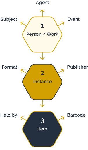
Find a new hierarchy in the information architecture to make the content easier to understand and more accessible for all kinds of users.
Sketch out rough wireframes and have weekly meeting with the subject matter experts to keep tweaking the interface over time while getting wiser.

Even though the development team was included in the process from the very beginning is not until the sketches start looking more like a potential product that we have a conversation about that is and not possible so we agree on the following hierarchy.
What does the development team think about the first sketches?
1. What is a must have for the MVP?
2. What is important but can wait?
3. What is nice to have but not crucial?
How should the User Interface look like?
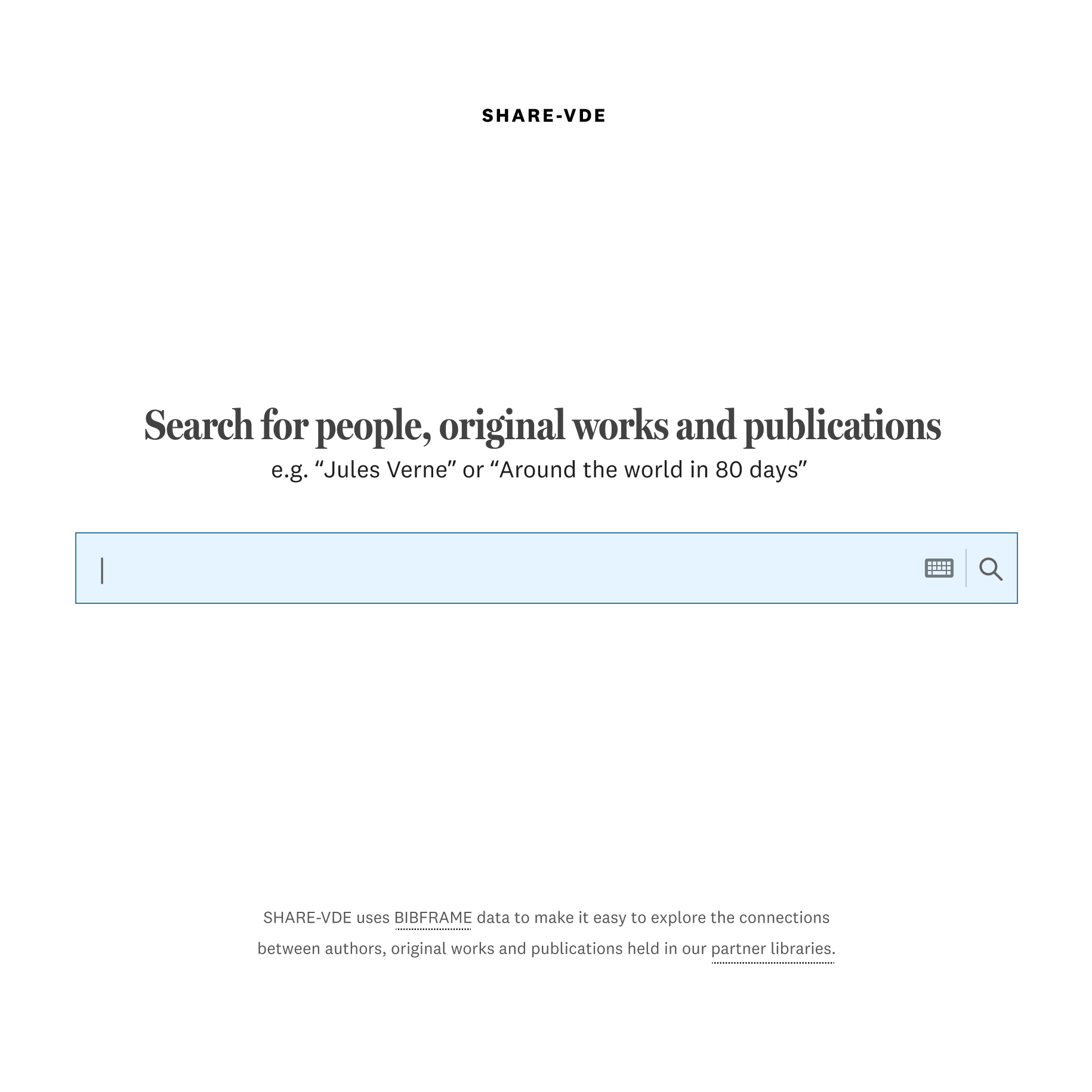
Simplify the content as much as possible, use one single search bar

Avoid using colors since the covers of the books can have many

Define a good hierarchy in the font sizes and styles
Previous design vs new design


How can we measure the success of this project?
10+ institutions joined the project after seeing the final result
It is 70% faster for students to find the resources in their libraries
The new hierarchy made that less users abandoned the flow half-way
Even though the design is finished, Share-VDE is just the beginning of a family of projects that will use the same interface adapted to their needs. Share-Art, Share-Music, J. Cricket, OPACs…